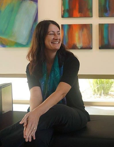
Artist Statement
For me, creating art is process of recording an inner dialogue by using color and composition as language. Building and destroying shapes are part of the struggle between a conscious control of design and a subconscious emergence of form. Transparent layers in my work preserve brushstrokes in a visual recording of each decision that led to the finished piece.
The final result may be evocative of a cloudscape, in that the natural forms reflect movement of atmospheric energy. However, I strive to minimize overt visual cues that may lead to a literal interpretation of the image. This allows each individual to draw on his or her own experience and perception to derive meaning from the work. The painting provides a platform to create a unique visual realm that transcends beyond the tangible surface to bring an intangible experience to the viewer.
About the Nebula Series
Using nebulae as a subject for a series is a natural extension of my previous work with clouds. Instead of water vapor, nebulae consist of massive towers of gas and dust. They may be light years away, yet the patterns, shapes, and forms are similar to a cloud in the earth’s atmosphere. What appears to be a tranquil, graceful form is really the remnant of a violent explosion that could have happened hundreds or thousands of years ago.
Similarly, where in my work the finished piece often appears serene, it is the result of a process that involves an active dialogue with the canvas. I start with a general idea of where I want the image to go, but the energy from a brushstroke, or the way a color interacts with another on the canvas, often leads to a different direction entirely. I continually create and destroy forms in the struggle between balance and tension. Psychologically, the struggle is between exerting control and letting the subconscious emerge.
Artist Biography
Where are you from or where did you spend your youth?
I was born and lived in Flushing, Queens in New York until I was 14. I went to high school and college in central Florida. In 1991 I moved to Los Angeles and spent some time in Ventura before relocating to San Diego in 2006.
What is your educational experience or training?
I received my Bachelor of Arts from New College of Florida in 1991, with a major in Fine Art. The curriculum included life drawing, 2-D design, sculpture, color theory, art history, printmaking, and studio painting. I’ve also taken classes in scientific illustration at the University of Washington. My baccalaureate thesis focused on using color theory to express emotion and symbolism in non-objective art.
Upon graduating, I moved out to Los Angeles in 1991. I worked at a studio that made hand-drawn serigraph (silkscreen) reproductions of original artwork. My job was to deconstruct a painting into individual colors and hand draw the image, color by color, on individual silkscreens (each color was run separately). I learned a great deal about color mixing and brushwork technique. I also ran my own business as a graphic designer, doing desktop publishing and 3-D product art. I hand-painted the prototypes for product designs such as toys and collectibles for companies including Mattel, Warner Brothers, Disney, and Applause.
In 1998, I decided to go back to graduate school to pursue a career in environmental planning. I have continued my education informally by visiting as many art museums in major cities as possible.
What are some of the techniques you use in your artmaking? Do you have any aesthetic insights that you would like to share?
I’ve been told my paintings appear restful or calming. However, the final appearance belies the process that went into creating it. I may start with an idea about where I want the image to go, but the energy from a brushstroke, or the way a color interacts with another on the canvas, often leads to a different direction entirely. The painting develops as a dialogue with the canvas. I experiment with color, light, and texture to investigate what causes disharmony and what restores balance. I rotate the canvas, layering color and scraping it away to show what came underneath. I work in very thin transparent washes of acrylic almost like watercolors. I use big brushes (3 or 4 inches wide), a spray bottle to keep the canvas wet, and limit the palette to four or five colors to ensure that the colors will be integrated in the finished piece. For the Synthesis series, I used organic (carbon-based) synthetic pigments (such as Hansa Yellow Medium, Quinacridone Magenta, and Phthalo Blue) almost exclusively because of their high chroma (saturation) and exceptional transparency. Inorganic pigments based on natural minerals tend to be more opaque and (quite literally) muddy.
I don’t want the piece to appear too “finished” or too smooth. I try to capture the energy that goes into the creation of a piece – I have to struggle with it and I want to show a record of the struggle without the appearance of being overworked. As part of the process of creation and destruction, I often have to obliterate a part that I really like to save the rest of the piece. To quote Robert Motherwell, “each brushstroke is a decision.”
Psychologically, the struggle is between exerting control and letting the subconscious emerge. The work is not finished until I have resolved the struggle and achieved some kind of balance – or at least the intended discord. Many of the paintings are balanced compositionally in several different orientations.
What are some of your ideas or philosophies as related to art?
One of the forerunners of the non-objective movement, Wassily Kandinsky, formulated a philosophy about shapes and colors. He had a general belief that a painter cannot find real satisfaction in mere representation, but has a need to express his inner life. Kandinsky relates the painter's need to that of a musician's need to express himself in a non-materialistic or abstract manner. For Kandinsky, abstraction provided the basis for evolution of a universal, transcendent expression. These principles form the basis of his aesthetic theory and I endeavor to perpetuate these themes in my work.
Colors have physical characteristics that can be manipulated to achieve balance or discord, similar to the way a musician learns harmonies and scales. It has been demonstrated that colors can have different psychological effects on people and the colors themselves can also have different symbolic associations, dependent on cultural traditions (for example, the symbol of mourning is represented by black in certain cultures and yellow or white in others). These are the tools and vocabulary that the non-objective artist can use to convey an idea or feeling or simply allow color to be an effective subject in and of itself.
Lately, I have been interested in the movement of lyrical abstraction. Lyrical abstraction primarily conveys a sense of the larger spiritual outlook an artist chooses to infuse in a painting. It is more about a desire to communicate concepts, thoughts, ideas, and emotions abstractly, beyond merely exploring academic explorations of color and tone.
The process of having an open dialogue with the work itself while creating it, whether it be a painting, or piece of music, or any kind of craft, is essential. In my view it is increasingly more important in a digital era to have to physically work through what may initially appear to be mistakes and to be able to see the visible evidence of the creative process. We can’t digitally design our lives – life is messy and physical – and art should reflect that. The fascinating aspect comes from how we deal with the unexpected - by either exerting control to try to ensure our preconceived outcome or by adjusting our expectations to be open to a new or different way of perceiving success.
What artists or individuals have influenced your work? What outside inspiration do you pull from them?
My style and source of imagery were initially influenced by the paintings of Turner, Friedrich, Constable, and the great Romantics of the 19th Century that elevated nature to dramatic heights. Turner's style, in particular, has been a huge influence on me with his use of loose, expressive washes that give life to his paintings. There is a rhythmic quality to his paint strokes; the viewer can feel the energy that the artist has endowed on his pieces.
Kandinsky provided an early but critical influence on the power of non-objective art to express the spiritual nature of color, form, and shape. From Itten and Albers I learned the foundations of color theory. The works of Frankenthaler, Louis, and Pollock have influenced me in their process of artmaking by using expression as form. Motherwell and particularly the late works of Mark Rothko had a much greater impact on me when I was actually able to view their work in museums. When you are physically standing in front of a great work the effect is indescribable – you can feel the hairs rise up in the back of your neck. When that happens you know that you’ve made a deep and profound connection with not only the image but with the artist that created it. There is nothing in a textbook or website that can replace that.
What is the connection between your work and the medium that it is expressed in?
The medium of acrylic painting allows me free expression of form - the acrylic paint can be opaque or transparent, and the paint dries quickly, allowing a buildup of layers without getting muddy. White is used to bring light, or to make layers more opaque. Thin washes allow the gestural brushstrokes to remain visible.
Is there a purpose to the way you arrange/display your work? The spaces that you show in?
For the Synthesis exhibit we have created a contemplative space free of distractions; a space that invites the viewer to relax and experience each piece with the music. The gallery space has been modified to invite the viewer to take the time to really listen to the paintings.
Why do you choose to make art?
Science and art are the passions that drive me to create. The differences between science and art are often perceived as a tension of the rational versus the emotional, but in fact the two subjects share more aspects in common than not. Both disciplines are based on exploration, and often you learn more from the experiments that fail than those that succeed.
Is there a common theme found in your work?
I explore themes of balance and tension using color, depth and contrast. Dichotomies often lie at the core of human experience. The interaction of opposites, such as those between the rational/emotional, static/dynamic, and spiritual/corporeal define how we relate to the world and others. Investigating the source of disharmony leads to realization of the connectedness of reality. Just as the creative act transforms perception into awareness, I strive to create paintings that transcend the tangible surface to bring an intangible experience to the viewer and create a unique visual realm.
|